GRAPHICS and TEXT
Call it art, call it abstract, call it a unique discussion point about my blog and this particular post.
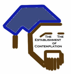
I've often wondered where logos come from and how businesses small and large come to identify and define themselves by a graphic of some kind. Then, when marketing teams get a hold of it, changes occur in all kinds of directions. I am sure some logos have changed for the better and some have returned to their nostalgic beginnings when the new did not gain the public interest it needed to. So I offer a design I have been considering for my own development and eventual graduation into graphical identity. At the very least I expect that the duplication of the word "The" will be called out, and even I am unsure that it was needed, but I would like to think that any title could be place in the middle of the face, I am not looking to place the title "The Establishment of Contemplation" within this graphic face forever, it's a test for the moment, so fear not, this is not the logo I am resting on for this site, simply a use of familiarity to see what people think. So please, I encourage you, send me your comments, share your thoughts, let me know if my graphic instincts have any hope at all!
Also, Thank you all, please keep enjoying visiting my site, I am exited to share that I have learned there have been 100 Page Views, so thank you all that contributed to the 100 Page Views to this site in the past week!
-The Establishment
Call it art, call it abstract, call it a unique discussion point about my blog and this particular post.
I've often wondered where logos come from and how businesses small and large come to identify and define themselves by a graphic of some kind. Then, when marketing teams get a hold of it, changes occur in all kinds of directions. I am sure some logos have changed for the better and some have returned to their nostalgic beginnings when the new did not gain the public interest it needed to. So I offer a design I have been considering for my own development and eventual graduation into graphical identity. At the very least I expect that the duplication of the word "The" will be called out, and even I am unsure that it was needed, but I would like to think that any title could be place in the middle of the face, I am not looking to place the title "The Establishment of Contemplation" within this graphic face forever, it's a test for the moment, so fear not, this is not the logo I am resting on for this site, simply a use of familiarity to see what people think. So please, I encourage you, send me your comments, share your thoughts, let me know if my graphic instincts have any hope at all!
Also, Thank you all, please keep enjoying visiting my site, I am exited to share that I have learned there have been 100 Page Views, so thank you all that contributed to the 100 Page Views to this site in the past week!
-The Establishment

 RSS Feed